VISUAL IDENTITY
DESIGN CONCEPT
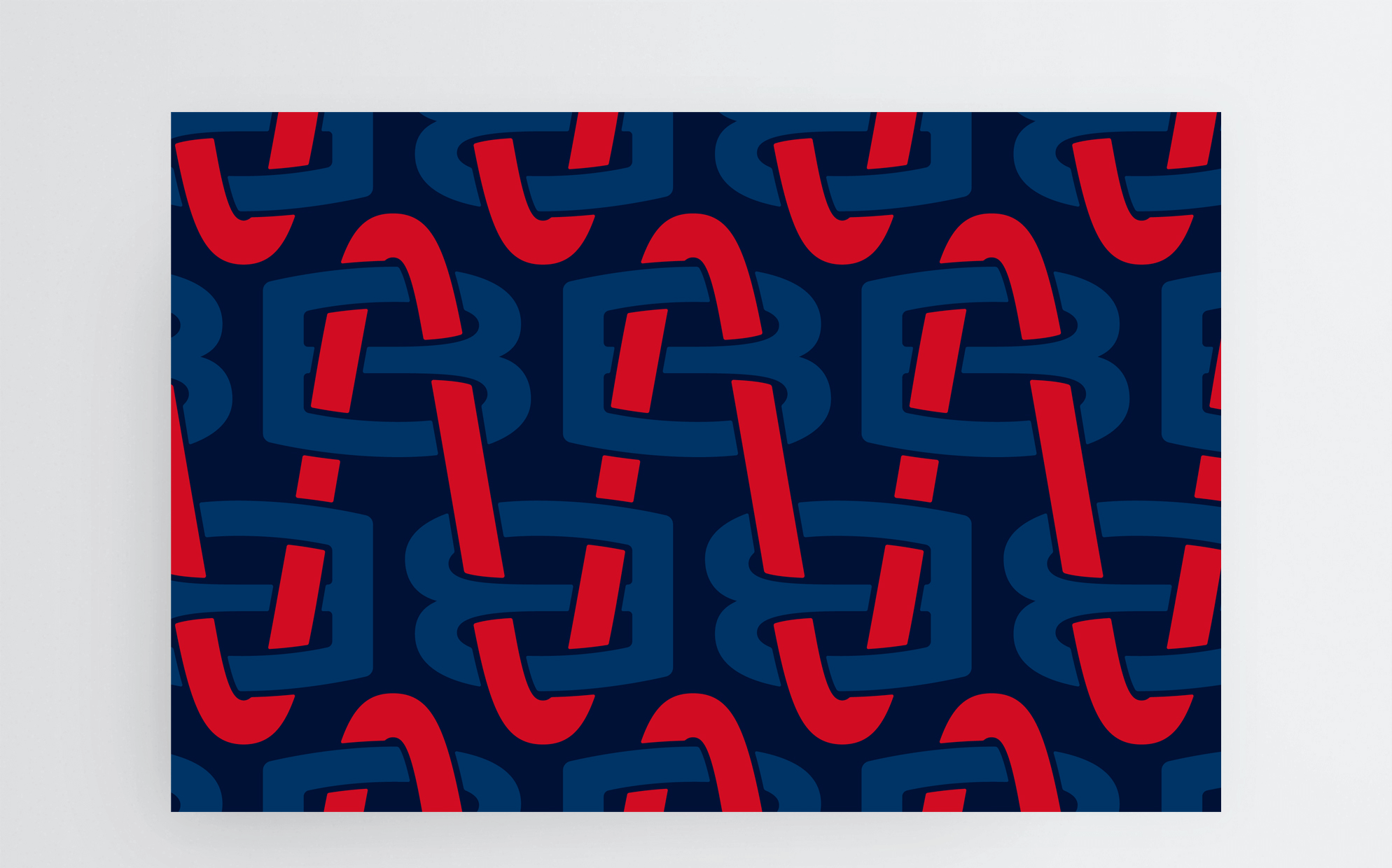
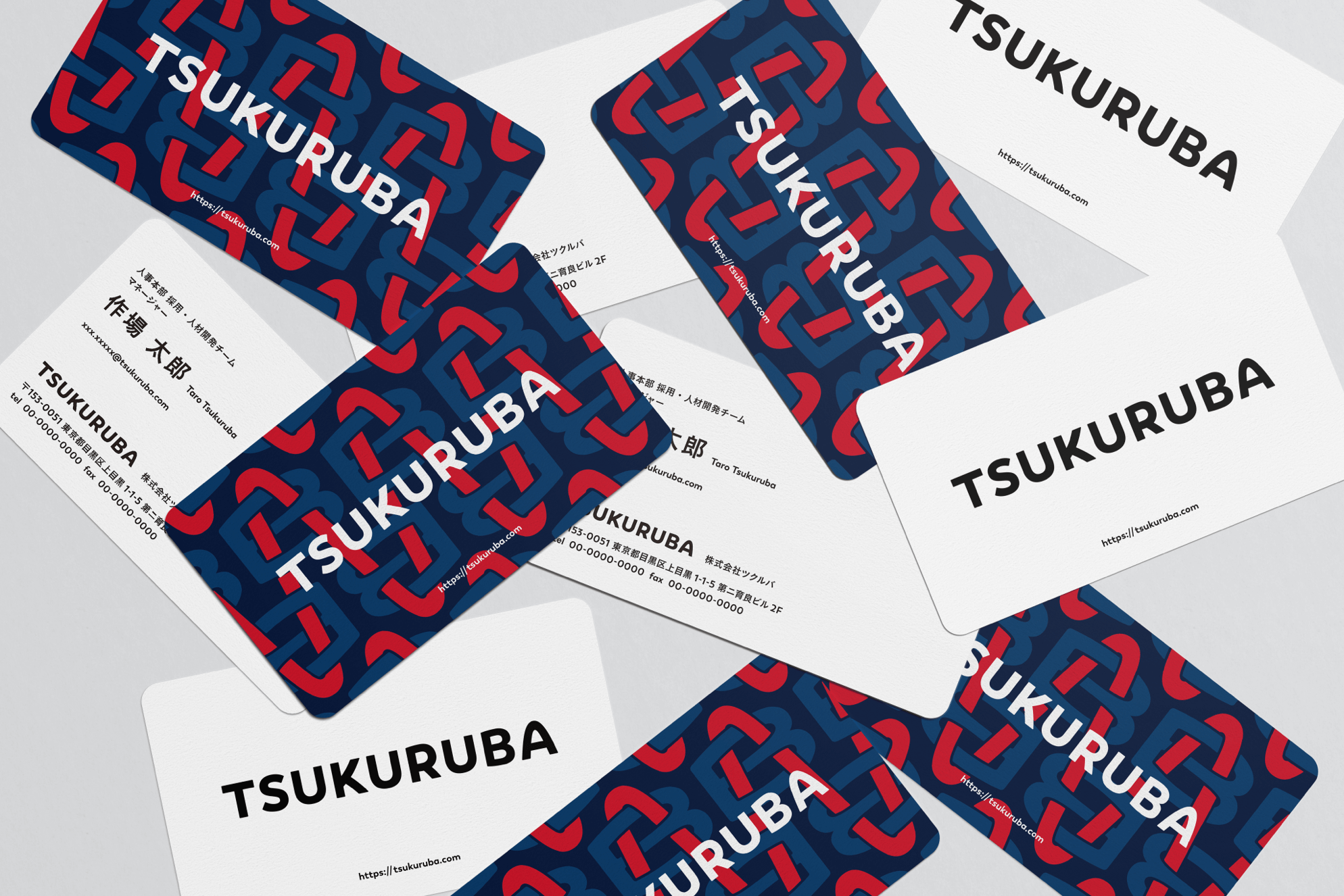
As a universal symbol to express our MISSION, we have renovated our V.I. at our tenth anniversary turning point. TSUKURUBA’s monogram pattern of "place = (BA)” has a design concept which expresses a will to continue making "a place" until now and from now on.
MONOGRAM PATTERN & LOGO TYPE
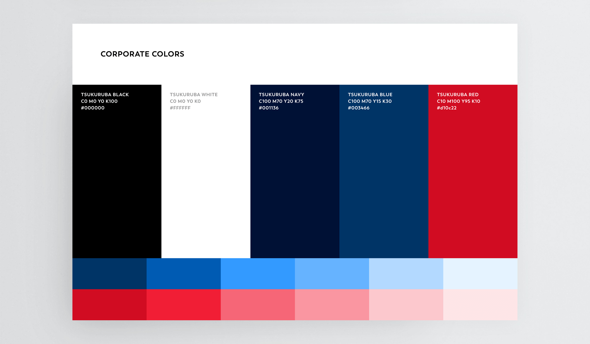
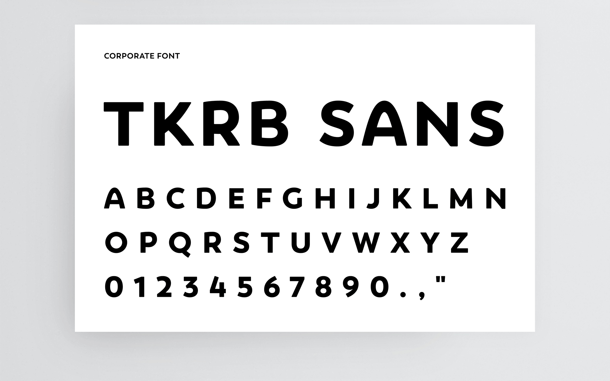
The monogram pattern expresses "the making of place" of TSUKURUBA enlarging "the place" (BA) as in monogram of "B" and "A". B (Business) is knit in beating A (TSUKURUBA’s coherent philosophy), and it becomes the design that "the place" (BA) spreads out without an end. As for the colors, "red" as the philosophy (emotion and passion), "blue" as the business (the logic and reason), and they express unification of the contradiction supplementing across the binary opposition like artery and vein. And we have set the logotype with the original calligraphic style which has monogram details.
LOGO RENEWAL PROJECT
We have released the story about the logo renewal project in tsukuruba note. You could see the thought to our new logo in detail.
